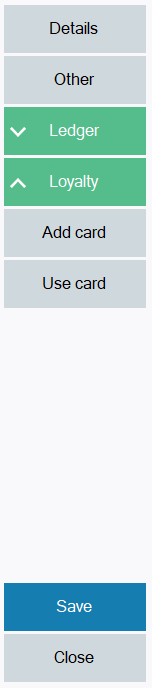
Touch Scroll Button Panel
A panel in which you can add buttons dynamically and support touch screen input. The panel can be scrolled if the buttons exceed the size of the panel.
Namespace: LSOne.Controls
Assembly: LSOne.Controls.TouchScrollButtonPanel
Syntax
public partial class TouchScrollButtonPanel : UserControl
Constructors
|
Name |
Description |
|---|---|
|
TouchScrollButtonPanel() |
Default constructor |
Properties
|
Name |
Description |
|---|---|
|
BackColor |
Get or set background color of the panel. |
|
BorderSpacing |
Get or set spacing around the panel. |
|
ButtonCount |
Get the number of buttons in the panel. |
|
ButtonHeight |
Get or set the height of the buttons. |
|
ColumnCount |
Get or set the number of columns in the panel, between 1 and 10. |
|
HorizontalMaxButtonWidth |
Get or set the maximum width of a button when the panel is set to be horizontal. |
|
HorizontalMinButtonWidth |
Get or set the minimum width of a button when the panel is set to be horizontal. |
|
IsHorizontal |
Get or set if the control should be vertical or horizontal. |
|
KeySpacing |
Get or set the spacing between buttons. |
|
SmallButtons |
Get or set if the buttons should be small or large. |
|
Style |
Get or set style of the buttons. Uses the IStyle interface to set the font, fore color, back color and shape. |
|
ToggleState |
Get or set the toggle state of the buttons. Uses the ToggleStateEnum enum.
|
Methods
|
Name |
Description |
|---|---|
|
AddButton(string caption, object tag, DockEnum dock, string key, IStyle style, Image image = null, ImageAlignment imageAlignment = ImageAlignment.Center) |
Add a button to the panel. This method has multiple overloads. |
|
Clear() |
Clears all buttons from the panel. |
|
CreateButtonStyle(Color foreColor, Color backColor, Color backColor2) |
Returns an IStyle object with the supplied color parameters. |
|
SetAllButtonsEnabled(bool enabled) |
Sets all buttons enabled or disabled. |
|
SetAllButtonsPressed(bool pressed) |
Sets all buttons pressed or not pressed. |
|
SetButtonCaption(string key, string caption) |
Sets the caption of the button with the specified key. |
|
SetButtonClickable(int index, bool value) |
Sets if the button at the specified index is clickable. |
|
SetButtonEnabled(bool enabled) |
Sets the if the button with the specified key is enabled. |
|
SetButtonPressed(int index, bool value) |
Sets the if the button with the specified index is pressed. |
|
SetButtonPressed(string key, bool pressed) |
Sets the if the button with the specified key is pressed. |
|
SetButtonPressedStyle(int index, IStyle value) |
Sets the style of the button at the specified index, when pressed. |
|
SetButtonStyle(int index, Color foreColor, Color backColor, Color backColor2) |
Sets the style of the button at the specified index, with the specified colors. |
|
SetButtonStyle(int index, IStyle value) |
Sets the style of the button at the specified index. |
Events
|
Name |
Description |
|---|---|
|
Click |
Occurs when a button is clicked. |
Examples

See Source\POS\Other\POSSharedDialogs\PayCustomerAccountDialog.cs from DevPack for usage examples.

