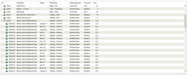
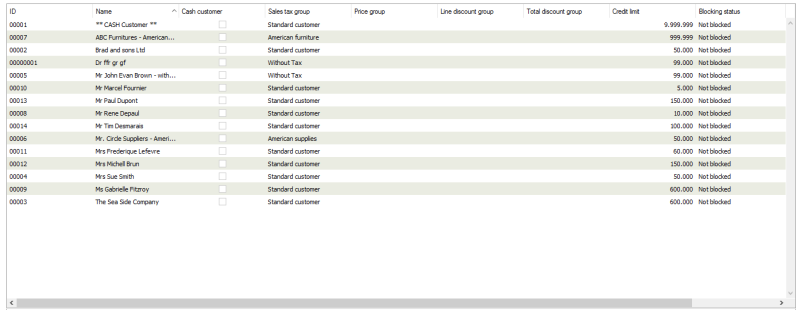
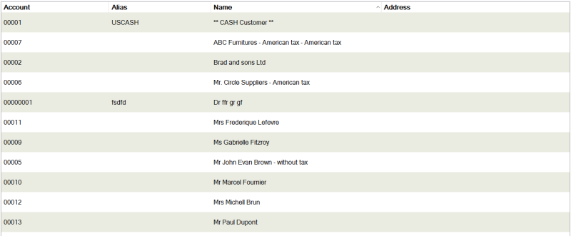
List View
Grid component to display tabular data.
Namespace: LSOne.Controls
Assembly: LSOne.Controls.ListView
Syntax
/// <summary>
/// LS Retail ListView control, based on Einhugur Grid engine technology
/// </summary>
//[ToolboxBitmap(@"\\LSRetail.SharedControls.ListView.LSListView.bmp")]
//[ToolboxBitmap(typeof(ListView), "LSListView.bmp")]
public partial class ListView : UserControl
Constructors
| Name | Description |
|---|---|
| ListView() | Default constructor. |
Properties
| Name | Description | ||
|---|---|---|---|
| AutoSelectOnFocus | Gets or sets the selected row when the control has focus | ||
| BuddyControl | Gets or sets the associated control (might be a text box for editable cells in the list view) | ||
| CanScrollDown | Gets a boolean value that represents the current vertical scroll bar position reached its maximum range or not | ||
| CanScrollUp | Gets a boolean value that represents the current vertical scroll bar position reached its minimum range or not | ||
| Columns | Gets the collection of all LSOne.Controls.Columns.Column defined for the current list view | ||
| ContentAreaSize | Gets the size of the control's content area | ||
| ContentBackColor |
Gets or sets the background color of the control's content (does not affect header and vertical or horizontal scrollbars) Default value: white |
||
| DefaultCell | Gets the base Cell that makes up the grid | ||
| DefaultHeaderStyle | Gets the header style of the control | ||
| DefaultRowHeight |
Gets or sets the size of the Row height Default value: 18 |
||
| DefaultStyle | Gets the style applied to all Cell | ||
| DimSelectionWhenDisabled |
Gets or sets if the background and text color are highlighted on focus Default value: false |
||
| DragReorder |
Gets or sets if the rows can be reordered by drag and drop Default value: false |
||
| EvenRowColor |
Gets or sets the background color of the even rows Default value: white |
||
| FirstRowOnScreen | Gets the id of the first visible row | ||
| HeaderFont |
Gets or sets the header font Default value: none |
||
| HeaderHeight |
Gets or sets the header row height Default value: 22 |
||
| HorizontalScrollbar |
Gets or sets if the horizontal scrollbar is displayed Default value: false |
||
| OddRowColor |
Gets or sets the background color of the odd rows Default value: white |
||
| RowCount | Gets the total number of rows | ||
| RowCountOnScreen | Gets the number of rows that are displayed (visible) | ||
| RowLineColor |
Gets or sets the row spacer color Default value: light gray |
||
| RowLines |
Gets or sets if the row spacers are displayed Default value: false |
||
| Rows | Gets the list of rows | ||
| SecondarySortColumn |
Gets or sets the index of the column used for secondary sorting. Used only when the internal sort is not used or if custom behavior is needed otherwise the Column.SecondarySortColumn should be used Default value: -1 |
||
| Selection | Gets the current selection (could be one or more rows/cells) | ||
| SelectionModel |
Gets or sets if multiple rows can be selected. Available options:
Default value: FullRowSingleSelection |
||
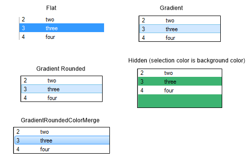
| SelectionStyle |
|
||
| ShowRowOnScreen | Sets the first selected row into view | ||
| SortColumn | Gets the primary sort column | ||
| SortedAscending | Gets the sort order | ||
| SortSetting | Gets or sets the sort column and order as string | ||
| TouchScroll |
Gets or sets if the control supports touch scroll Default value: false |
||
| UseFocusRectangle |
Gets or sets if the focus indicator is displayed if nothing is selected Default value: true |
||
| VerticalScrollbar |
Gets or sets if vertical scroll bar is displayed Default value: true |
||
| VerticalScrollbarValue | Sets the position of the vertical scroll bar |
Methods
| Name | Description |
|---|---|
| AddRow(LSOne.Controls.Rows.Row) | Adds the given row to the control |
| ApplyRelativeColumnSize() | Calculates an optimized size for each column based on column's RelativeSize setting such that the whole content of the control is filled |
| ApplyTheme(LSOne.Controls.Themes.IListViewTheme) | Applies the given theme to the control |
| AutoSizeColumns() |
Calculates an optimized size for each column such that the whole content of the control is filled. If the property FillRemainingWidth is set to true on one of the columns in the list, the width of that column is increased to fill the width of the list after the width of all columns has been set to match the content. |
| AutoSizeColumns(bool) | Calculates an optimized size for each column such that the whole content of the control is filled |
| CalculateLayout() | Determines the scroll bar maximum value as the number of rows |
| CellBounds(int, int) | Returns the bounds of the cell specified by its column and row number |
| CellFromPoint(System.Drawing.Point, int, int, System.Drawing.Rectangle, bool) | Returns the column and row number and the bounds of the cell that contains the given point |
| ClearRows() | Clears all rows |
| CreateSortSetting(int, bool) | Returns the sort string for the given column and sort order |
| FirstCellAction(bool) | Executes the first cell Action handler registered |
| InsertRow(int, LSOne.Controls.Rows.Row) | Inserts the given row at the given index |
| InvalidateContent() | Invalidates control's content area |
| MovePageDown() | Scrolls one page down |
| MovePageDown(bool) | Scrolls one page down and selects first visible row |
| MovePageUp() | Scrolls one page up |
| MovePageUp(bool) | Scrolls one page up and selects first visible row |
| MoveRowDown(int) | Scrolls one row down and selects it |
| MoveRowUp(int) | Scrolls one row up and selects it |
| MoveSelectionDown() | Selects the next row |
| MoveSelectionUp() | Selects the previous row |
| NextCellAction(bool) | Executes the next cell Action handler registered |
| RemoveRow(int) | Removed the row at given index |
| Row(int) | Gets the row at given index |
| Row(uint) | Gets the row at given index |
| RowIsOnScreen(int) | Returns true if the row at the given index is displayed |
| ScrollOneDown() | Scrolls one row down |
| ScrollOneUp() | Scrolls one row up |
| ScrollPageDown() | Scrolls one page down |
| ScrollPageUp() | Scrolls one page up |
| ScrollRowIntoView(int) | Displays the page containing the row with the given index |
| SelectAll() | Selects all rows |
| SetColumnCollection(LSOne.Controls.Columns.ColumnCollection) | Configures the control with the given collection of columns |
| SetSortColumn(int, bool) | Sets the sort column to the column at the given index and if the sorting should be ascending |
| SetSortColumn(LSOne.Controls.Columns.Column, bool) | Sets the sort column to the given column and if sorting should be ascending |
| Sort() | Sorts the control's rows based on the configured sort column or sorts after the first column if no sorting is set |
| Sort(LSOne.Controls.Columns.Column, bool) | Sorts by the given column |
| SwapRows(int, int) | Changes the selected row |
Events
| Name | Description |
|---|---|
| CellAction | Occurs when an action happens in the cell (setting text, setting checkbox state, etc) |
| CellActionGotFocus | Occurs when the cell requiring action gets focus |
| CellDropDown | Occurs when a Drop Down Cell executes its action |
| HeaderClicked | Occurs when the header is clicked |
| HorizontalScrollValueChanged | Occurs when the horizontal scroll bar value changes |
| RowClick | Occurs on row click |
| RowCollapsed | Occurs when a row is collapsed |
| RowDoubleClick | Occurs when a row is double clicked |
| RowExpanded | Occurs when a row is expanded |
| RowReorder | Occurs when a row is reorderes |
| SelectionChanged | Occurs when the row selection changes |
| VerticalScrollValueChanged | Occurs when the vertical scroll bar value changes |
Remarks
The control supports multiple types of cells, as long as they derive from Cell class. Already available are the following :
- Button Set Cell
- Check Box Cell
- Collapsable Cell
- Color Box Cell
- Date Time Cell
- Drop Down Cell
- Editable Cell
- Extended Cell
- Header Cell
- Icon Button Cell
- Icon Button Numeric Cell
- Icon Tooltip Cell
- Image Browser Cell
- Image Cell
- Large Checkbox Cell
- Link Cell
- Numeric Cell
- Tooltip Cell
- Virtual Collapsable Cell
While cells can be added to a simple Row, there are a couple of specialized types of rows:
Examples

See source code from DevPack for usage examples:
- without touch support
- Source\SM\Plugins\RetailItems\View\ItemsView.cs
- with touch support
- Source\Core\Common_services\CustomerOrderService\Dialogs\CustomerOrderAction.cs
- Source\POS\Services\DimensionService\Dialogs\DimensionDialog.cs


